
So...our Generation 1 Transformers
It's fine to experiment but I and some others worry this is a sign that maybe the whole franchise might shift into a movie-injected aesthetic. It's not even my personal distaste for the look of the movie bots...it's just that I don't want the whole feel of the brand to change just because one part of it has more exposure. It'd be like when the X-Men comics suddenly had everyone in black leather after the first X-Men film
It's probably going too far to assume this is some telling shift for the franchise at large, but it still makes you wonder if that might be happening.
I know a lot of people rag on the "liquid metal faces" but...it just looks so much nicer to me than whatever the hell is going on here. It may be more logical that they have all sorts of different plates in their faces, but it just appears cluttered and makes them look like any old cold, random robot. One of the main attributes of the Transformers franchise, and one of the main charms as far as I'm concerned, is that the robots are relatable, with personalities akin to that of humans. I think the smoother, simpler faces teeter more towards the human-like side of the spectrum and serve as a better physical mirror of the personalities, and yes, I think it has been done convincingly without going too far ala teeth and tongues. This high-tech, almost skeletal look loses a bit of that charm and serves as a slight disconnect from their...perceived human-like nature, I think.
A post from Nato Bot at TFW hit it well, I think:
I just got my issue in the mail today. I agree that Don's work is awesome. I like what he's done with their bodies, just not the faces. I've been trying some similar things with my own work. I just keep coming back to the more emotive nature of the "liquid metal" approach (which I've never seen as liquid metal but as some sort of combination of metallic cells bonded with a softer cellular bond to make a flexible, yet durable metal-like "skin". If you think of TFs as living biological organisms with cells like every other living thing we know of [just metallic ones], then it makes sense).
I think that it might have worked for the movie, but in a comic book all the extra lines just make the faces look too busy and cluttered, not to mention skeletal. Which (as was stated before) is cool for bad guys like Bludgeon, but not good for the good guys. Especially if you want a human reader to identify emotionally with the characters. Judge for yourself:
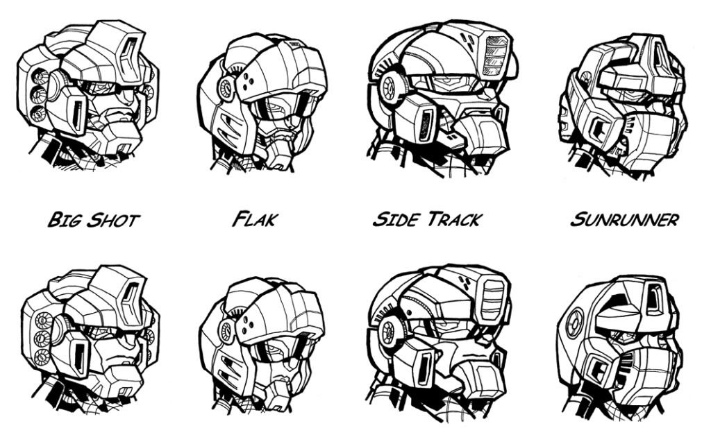
That image really drives the point home.
damnit..... typed up a big ass reply then miss clicked and hit the monetize blog BS at the bottom... either way
ReplyDeleteit is jarring to look at but I don't dis-like it.
really sells them as being complete robots under the skin rather than just boxes stuck together to make a robot. like if you took them apart there would be a whole robot under the armor.
then again perhaps I am just de-sensitized.
One complaint: with there upper teeth always showing they look like Fire Marshal Bill.
GAH! Very jarring. The most bizzare aspect is seeing G1 Prime with a mouth. At least he can finally eat now. I agree it looks cluttered. Almost like they've got stuff on thier faces.
ReplyDeleteOh well, I can deal.
and several issues of the new ongoing series later, the debate rages on (I was just linked to your follow-up entry).
ReplyDeleteI have to say, your comment about black leather X-men costumes made me laugh - that is exactly what they did, so that new readers brought in by the movies would have a familiar visual reference. just look up "frank quitely x-men" for some examples
yeah
ReplyDelete